# LinkSelector
Custom panel component for selecting a link.
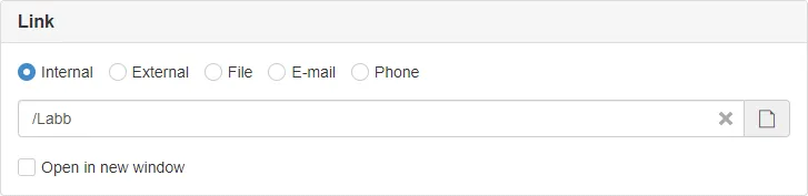
> **DEPRECATED**
>
> Since Sitevision 9.1 a new type of node selector is available for selecting links.\
> [NodeSelector](/packages/config-svelte/components/nodeselector/) should be used instead of this component.
>
> ```svelte
>
> ```
>
> A [sv:link](https://developer.sitevision.se/docs/public-api/node-types/node-types/2018-01-12-svlink) will be returned.
>
> ```js
> import appData from '@sitevision/api/server/appData';
>
>
> const uri = appData.get('link', 'rawURI');
> const newWindow = appData.get('link', 'openInNewWindow');
> ```
## Props
| Prop | Type | Description |
| ---------- | --------------- | ------------------------------------------------------------------------------------------------------------------------------- |
| `heading` | `string` | Panel heading. **Default:** `undefined` |
| `name` | `string` | If SiteVision default functions for getting and setting config are used, name must be set. **Default:** `undefined` |
| `disabled` | `boolean` | If the control is disabled. **Default:** `false` |
| `required` | `boolean` | If the control is required. **Default:** `false` |
| `show` | `boolean` | Show and hide the component without re-rendering. **Default:** `true` |
| `types` | `Array` | What types of links to be selectable, must provide at least one. **Default:** `['internal', 'external', 'file', 'mail', 'tel']` |
| `value` | `any` | Used if bound to value. **Default:** `undefined` |
## Example
```svelte
```
Advanced**
> **NOT RECOMENDED**
>
> Usually the usage of `name` is enough for 99% of use cases.
```svelte
```
## AppData
If used with standard name all values will be prefixed with the name property provided to the component.\
For example if `name="link"` the values will be available as `linkValue`, `linkType` and `linkNewWindow`.
```js
import appData from '@sitevision/api/server/appData';
function getLink() {
return {
value: appData.get('linkValue', 'URI'),
type: appData.get('linkType'),
newWindow: appData.get('linkNewWindow'),
}
}
```
## Slots
Top and bottom slots before and after link selector.
```svelte
Hjälptext...
```