CheckboxGroup
| Prop | Type | Description |
|---|---|---|
id | string | Unique identifier for the component. Default: generateId() |
name | string | Name attribute for the checkbox group. |
options | Array<string> Array<{ label, value }> | Array of options for the checkbox group. |
legend | string | Fieldset legend. |
description | string | Description text displayed below the legend. |
legendVisuallyHidden | boolean | If the legend should be hidden visually. Default: false |
disabled | boolean Array<string> | If the field is disabled. Can disable all options or specific ones. Default: false |
show | boolean | Show or hide the component without re-rendering. Default: true |
value | Array<string> | Bound value for the checkbox group. Default: undefined |
Example
Section titled “Example”<script> import { Panel, CheckboxGroup } from '@soleil-se/config-svelte';</script>
<Panel heading="Inställningar"> <CheckboxGroup name="checkboxGroup1" legend="Checkboxgrupp 1" options={['Värde 1', 'Värde 2', 'Värde 3']} /> <CheckboxGroup name="checkboxGroup2" legend="Checkboxgrupp 2" description="A helpful description for the checkbox group" options={[ { label: 'Värde 1', value: 'value1'}, { label: 'Värde 2', value: 'value2'}, { label: 'Värde 3', value: 'value3'}, ]} /></Panel>Advanced
<script>  import { Panel, CheckboxGroup } from '@soleil-se/config-svelte';  import { onSave } from '@soleil-se/config-svelte/utils';
  const { values } = $props();
  values = {    checkboxGroup1: [],    checkboxGroup2: [],    ...values  };
  onSave(() => values);</script>
<Panel heading="Inställningar"> <CheckboxGroup bind:value={values.checkboxGroup1} legend="Checkboxgrupp 1" options={['Värde 1', 'Värde 2', 'Värde 3']} /> <CheckboxGroup bind:value={values.checkboxGroup2} legend="Checkboxgrupp 2" options={[ { label: 'Värde 1', value: 'value1'}, { label: 'Värde 2', value: 'value2'}, { label: 'Värde 3', value: 'value3'}, ]} /></Panel>Default
Section titled “Default”Default slot after checkbox group.
<CheckboxGroup name="checkboxGroup" legend="Checkbox group" {options} /> <p>Element in the checkbox group</p></CheckboxGroup>Legend
Section titled “Legend”Slot for the text in the legend element.
<CheckboxGroup name="checkboxGroup" {options} /> {#snippet legend()} Custom <em>legend</em> {/snippet}</CheckboxGroup><CheckboxGroup name="checkboxGroup" {options} /> <svelte:fragment slot="legend"> Custom <em>legend</em> </svelte:fragment></CheckboxGroup>Description
Section titled “Description”Slot for content in the description in the legend element.
<CheckboxGroup name="checkboxGroup" {options} /> {#snippet description()} Custom <em>description</em> {/snippet}</CheckboxGroup><CheckboxGroup name="checkboxGroup" {options} /> <svelte:fragment slot="description"> Custom <em>description</em> </svelte:fragment></CheckboxGroup>Default value
Section titled “Default value”Use the value prop to set a default value when not binding the value:
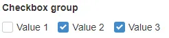
<CheckboxGroup name="checkboxGroup1" legend="Checkboxgrupp 1" options={['Värde 1', 'Värde 2', 'Värde 3']} value="{['Värde 2', 'Värde 3']}"/>