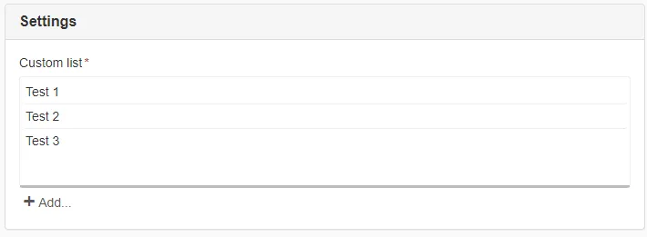
CustomList
A sortable list component for adding multiple grouped configuration components in modals.
| Prop | Type | Description |
|---|---|---|
label | string | Label for the list. Default: undefined |
description | string | Description for the list. Default: undefined |
required | boolean | Whether the list is required. Default: false |
name | string | Name attribute for the list. Default: undefined |
disabled | boolean | Disable the list. Default: false |
show | boolean | Show and hide the component without re-rendering. Default: true |
icon | string | Icon class for the list items. Default: undefined |
value | Array<any> | Value associated with the list. Default: [] |
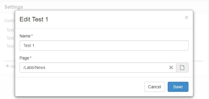
The displayed name in the listing and modal heading is taken from the first input field value.
It’s recommended to use InputField or NodeSelector as first component in the main slot.
Example
Section titled “Example”The slot prop id is used to identify and group the components.
This id needs to be prefixed to the name attribute.
<script>  import { Panel, CustomList, InputField, NodeSelector } from '@soleil-se/config-svelte';</script>
<Panel>  <CustomList name="customList" label="Custom list" let:id>    <InputField name="{id}_name" label="Name" />    <NodeSelector name="{id}_page" label="Page" />  </CustomList></Panel>
Advanced
This component is currently not fully supported in advanced configs out of the box.
If you need to use it in an advanced config you can manually handle the state to normalize
and flatten it for saving to the server. If you use bind:value treat it as a readonly since any changes will be lost.
You can use the exported function addItems({id:String,name:String}) to add values.
<script>  import { Panel, CustomList, InputField, NodeSelector } from '@soleil-se/config-svelte';
  let listInstance;
  function addToList(){    listInstance.addItem({ id: 'id', name: 'name' });  }</script>
<Panel>  <CustomList name="customList" label="Custom list" let:id bind:this={listInstance}>    <InputField name="{id}_name" label="Name" />    <NodeSelector name="{id}_page" label="Page" />  </CustomList></Panel>
AppData
Section titled “AppData”The ids are saved as an array on the key supplied on the name attribute of the list.
Traverse the array and get appData prefixed with this id.
import appData from '@sitevision/api/server/appData';
function getCustomList() { return appData.getArray('customList')?.map((id) => ({ name: appData.get(`${id}_name`), pageUri: appData.get(`${id}_page`, 'URI'), })) || [];}Pass an icon class to the list item, this can be an already existing icon from sitevision-icon or glyphicons that are available in edit mode or a custom class.
No list of icons is available, but you can inspect an icon in the edit interface and copy the class name.
<script>  import { Panel, CustomList, InputField, NodeSelector } from '@soleil-se/config-svelte';</script>
<Panel>  <CustomList name="customList" label="Custom list" icon="sitevision-icons file" let:id>    <InputField name="{id}_name" label="Name" />    <NodeSelector name="{id}_page" label="Page" />  </CustomList></Panel>
List item template
Section titled “List item template”Sometimes you want full control over the list items, if some other value than the first input field
wants to be displayed or a completely custom template.
For this to work it’s easiest to handle the modal content in a separate component.
<script>  import { Panel, CustomList } from '@soleil-se/config-svelte';  import Settings from './Settings.svelte';</script>
<Panel> <CustomList name="customList" label="Custom list" let:id> <Settings {id} /> </CustomList></Panel><script> import { InputField, NodeSelector, CustomListItemTemplate } from '@soleil-se/config-svelte';
export let id; let name;</script>
<CustomListItemTemplate> Page: {name}</CustomListItemTemplate><InputField name="{id}_name" label="Name" bind:value={name} /><NodeSelector name="{id}_page" label="Page" type="page-selector" />Dynamic content
Section titled “Dynamic content”A more advanced example with dynamically fetched content, a manual update of the list item is needed on mount since the list doesn’t know when all data is available.
<script>  import { Panel, CustomList } from '@soleil-se/config-svelte';  import Settings from './Settings.svelte';</script>
<Panel> <CustomList name="customList" label="Custom list" let:id let:triggerUpdate> <Settings {id} {triggerUpdate} /> </CustomList></Panel><script> import { NodeSelector, CustomListItemTemplate } from '@soleil-se/config-svelte'; import { onMount } from 'svelte';
export let id; export let triggerUpdate;
let pageId; let name; let url;
async function fetchPageDetails() { if (!pageId) return; const res = await fetch(`/rest-api/1/0/${pageId}/properties`) .then((res) => res.json());
name = res.displayName; url = res.URL; }
onMount(() => { await fetchPageDetails(); triggerUpdate(); });
</script>
<CustomListItemTemplate> {name} ({url})</CustomListItemTemplate><NodeSelector name="{id}_page" label="Page" on:change={fetchPageDetails} bind:value={pageId} />Default
Section titled “Default”Default slot inside modal.
<CustomList name="customList" label="Custom list" let:id> <InputField name="{id}_name" label="Name" /> <NodeSelector name="{id}_page" label="Page" /></CustomList><CustomList name="customList" let:id> {#snippet label()} Custom <strong>label</strong> {/snippet} <InputField name="{id}_name" label="Name" /> <NodeSelector name="{id}_page" label="Page" /></CustomList><CustomList name="customList" let:id> <svelte:fragment slot="label"> Custom <strong>label</strong> </svelte:fragment> <InputField name="{id}_name" label="Name" /> <NodeSelector name="{id}_page" label="Page" /></CustomList>Description
Section titled “Description”<CustomList name="customList" let:id> {#snippet description()} Custom <strong>description</strong> {/snippet} <InputField name="{id}_name" label="Name" /> <NodeSelector name="{id}_page" label="Page" /></CustomList><CustomList name="customList" let:id> <svelte:fragment slot="description"> Custom <strong>description</strong> </svelte:fragment> <InputField name="{id}_name" label="Name" /> <NodeSelector name="{id}_page" label="Page" /></CustomList>