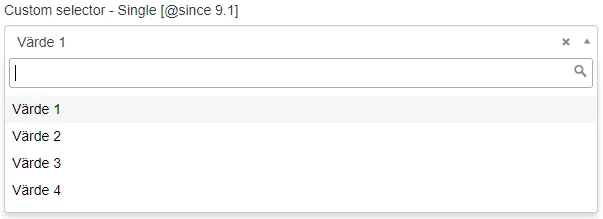
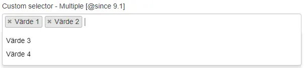
CustomSelector
Wrapper component for Sitevision Custom selector.
| Prop | Type | Description |
|---|---|---|
id | string | ID, generates automatically if nothing is passed. Default: generateId() |
label | string | Label for the selector. Required. Default: undefined |
description | string | Description for the selector, displayed below the label. Default: undefined |
name | string | Name attribute for the selector. Default: undefined |
placeholder | string | Placeholder text for the selector. Default: undefined |
options | Array<{label, value}> | Array of options for the selector. Default: [] |
searchable | boolean | Whether the selector is searchable. Default: false |
removable | boolean | Whether selected options can be removed. Default: true |
required | boolean | Whether the selector is required. Default: false |
disabled | boolean | Disable the selector. Default: false |
multiple | boolean | Whether multiple options can be selected. Default: false |
show | boolean | Show and hide the component without re-rendering. Default: true |
value | string | Array<any> | Value associated with the selector. Default: '' |
Example
Section titled “Example”<script> import { Panel, CustomSelector } from '@soleil-se/config-svelte';
const options = [ { label: 'Värde 1', value: 'value1' }, { label: 'Värde 2', value: 'value2' }, { label: 'Värde 3', value: 'value3' }, ];</script>
<Panel heading="Inställningar"> <CustomSelector name="custom" label="Custom selector" {options} /></Panel>Advanced
<script>  import { Panel, CustomSelector } from '@soleil-se/config-svelte';  import { onSave } from '@soleil-se/config-svelte/utils';
  let { values } = $props();
  values = {    custom: '',    ...values  }
  onSave(() => values);</script>
<Panel heading="Inställningar"> <CustomSelector label="Custom selector" {options} bind:value={values.custom} /></Panel>Default
Section titled “Default”Default slot after selector.
<CustomSelector name="custom" label="Custom selector" {options} > <p>Some text.</p></CustomSelector>Slot for content in the label element.
<CustomSelector name="custom" {options}> {#snippet label()} Custom <strong>label</strong> {/snippet}</CustomSelector><CustomSelector name="custom" {options}> <svelte:fragment slot="label"> Custom <strong>label</strong> </svelte:fragment></CustomSelector>Description
Section titled “Description”Slot for content in the description element to be used instead of the prop when HTML formatting is needed.
<CustomSelector name="custom" {options}> {#snippet description()} Custom <strong>description</strong> {/snippet}</CustomSelector><CustomSelector name="custom" {options}> <svelte:fragment slot="description"> Custom <strong>description</strong> </svelte:fragment></CustomSelector>Option
Section titled “Option”Option slot for custom templating.
The option is available as slot prop.
<CustomSelector name="custom" {options}> {#snippet option(o)} {o.label} ({o.type}) {/snippet}</CustomSelector><CustomSelector name="custom" {options}> <svelte:fragment slot="option" let:option> {option.label} ({option.type}) </svelte:fragment></CustomSelector>