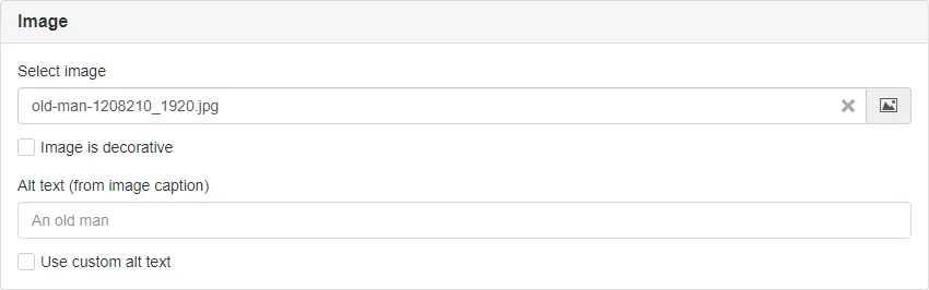
ImageSelector
Custom panel component for selecting an image.
| Prop | Type | Description |
|---|---|---|
heading | string | Panel heading. Default: 'Bild' |
name | string | Name attribute. Default: undefined |
required | boolean | If the field is required. Default: false |
node | string | Node ID of the selected image. Default: undefined |
alt | string | Custom alt text. Default: undefined |
decorative | boolean | If the image is decorative. Default: false |
show | boolean | Show and hide the component without re-rendering. Default: true |
hideDecorative | boolean | If the checkbox for decorative image should be hidden. Default: false |
Example
Section titled “Example”<script> import { ImageSelector } from '@soleil-se/config-svelte';</script>
<ImageSelector name="image" heading="Bild" />
<!-- If decorative should be checked from the start, since 1.11.0 --><ImageSelector name="image" heading="Bild" decorative />AppData
Section titled “AppData”If used with standard name all values will be prefixed with the name property provided to the component.
For example if name="image" the values will be available as imageNode, imageAlt (if custom alt-text is set) and imageDecorative (if image is set as decorative, since 1.11.0).
import appData from '@sitevision/api/server/appData';
function getImage() { return { uri: appData.get('imageNode', 'URI'), alt: appData.get('imageDecorative') ? '' : appData.get('imageAlt') || appData.get('imageNode', 'alt'), }}Default slot
<ImageSelector name="image" heading="Bild" /> <p>Some text.</p></ImageSelector>