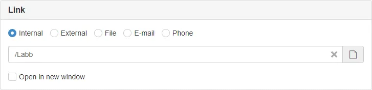
LinkSelector
Custom panel component for selecting a link.
| Prop | Type | Description |
|---|---|---|
heading | string | Panel heading. Default: undefined |
name | string | If SiteVision default functions for getting and setting config are used, name must be set. Default: undefined |
disabled | boolean | If the control is disabled. Default: false |
required | boolean | If the control is required. Default: false |
show | boolean | Show and hide the component without re-rendering. Default: true |
types | Array<string> | What types of links to be selectable, must provide at least one. Default: ['internal', 'external', 'file', 'mail', 'tel'] |
value | any | Used if bound to value. Default: undefined |
Example
Section titled “Example”<script> import { LinkSelector } from '@soleil-se/config-svelte';</script>
<LinkSelector name="link" heading="Länk" /><LinkSelector name="file" heading="Fil" types={['file']} />Advanced
<script>  import { LinkSelector } from '@soleil-se/config-svelte';  import { pluckPrefix, addPrefix, onSave } from '@soleil-se/config-svelte/utils';
  // Plucks object properties with keys prefixed with 'link' and removes the prefix.  // { linkType, linkValue, linkNewWindow } -> { type, value, newWindow }  let link = pluckPrefix('link');
  // Prefixes keys in an object  // { type, value, newWindow } -> { linkType, linkValue, linkNewWindow }  onSave(() => addPrefix('link', link));</script>
<LinkSelector bind:value={link} heading="Länk" />
AppData
Section titled “AppData”If used with standard name all values will be prefixed with the name property provided to the component.
For example if name="link" the values will be available as linkValue, linkType and linkNewWindow.
import appData from '@sitevision/api/server/appData';
function getLink() { return { value: appData.get('linkValue', 'URI'), type: appData.get('linkType'), newWindow: appData.get('linkNewWindow'), }}Top and bottom slots before and after link selector.
<LinkSelector name="link" heading="Knapp" disabled={!showLink}> <svelte:fragment slot="top"> <Checkbox name="showLink" bind:value={showLink} label="Visa knapp" /> <InputField name="linkText" required label="Text" disabled={!showLink} /> </svelte:fragment> <svelte:fragment slot="bottom"> <p class="help-block">Hjälptext...</p> </svelte:fragment></LinkSelector>