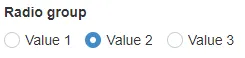
RadioGroup
| Prop | Type | Description |
|---|---|---|
id | string | Unique identifier for the component. Default: generateId() |
name | string | Name attribute for the radio group. Must be set if SiteVision default functions are used. |
legend | string | Fieldset legend. |
description | string | Description text displayed below the input field. |
legendVisuallyHidden | boolean | If the legend should be hidden visually. Default: false |
options | Array<string> Array<{ label, value }> | Array of options for the radio group. |
disabled | boolean | Array<string> | If the field is disabled. Can disable all options or specific ones. Default: false |
show | boolean | Show or hide the component without re-rendering. Default: true |
value | string | Bound value for the radio group. Default: '' |
Example
Section titled “Example”Standard
Section titled “Standard”<script> import { Panel, RadioGroup } from '@soleil-se/config-svelte';
const options1 = ['Värde 1', 'Värde 2', 'Värde 3']; const options2 = [ { label: 'Värde 1', value: 'value1' }, { label: 'Värde 2', value: 'value2' }, { label: 'Värde 3', value: 'value3' }, ];</script>
<Panel heading="Inställningar"> <RadioGroup name="radioGroup1" legend="Radio group 1" options={options1} value="Värde 1" /> <RadioGroup name="radioGroup2" legend="Radio group 2" options={options2} value="value1" /></Panel>Advanced
<script>  import { Panel, RadioGroup } from '@soleil-se/config-svelte';  import { onSave } from '@soleil-se/config-svelte/utils';
  const { values } = $props();
  values = {    radioGroup: '',    ...values,  };
  const options = ['Värde 1', 'Värde 2', 'Värde 3'];
  onSave(() => values);</script>
<Panel heading="Inställningar"> <RadioGroup bind:value={values.radioGroup} legend="Radio group" {options} /></Panel>Default
Section titled “Default”Default slot after radio group.
<RadioGroup name="radioGroup" legend="Radio group" {options} /> <p>Some text</p></RadioGroup>Legend
Section titled “Legend”Slot for content in the legend element.
<RadioGroup name="radioGroup" {options} /> {#snippet legend()} Custom <em>legend</em> {/snippet}</RadioGroup><RadioGroup name="radioGroup" {options} /> <svelte:fragment slot="legend"> Custom <em>legend</em> </svelte:fragment></RadioGroup>Option (since 1.26.0)
Section titled “Option (since 1.26.0)”Slot for content in each radio button’s label. The provided option parameter contains the full option object corresponding to the specific radio button as provided in the options array to the RadioGroup.
<RadioGroup name="radioGroup" {options} /> {#snippet option(o)} <span>{o.label || o}</span> <span>Custom <em>content</em></span> {/snippet}</RadioGroup><RadioGroup name="radioGroup" {options} /> <svelte:fragment slot="option" let:option> <span>{option.label || option}</span> <span>Custom <em>content</em></span> </svelte:fragment></RadioGroup>Default value
Section titled “Default value”Use the value attribute to set a default value:
<RadioGroup name="radioGroup" legend="Radio group" options={['Värde 1', 'Värde 2', 'Värde 3']} value="Värde 1"/>